INDIA SALES TRANSACTIONS
Data Cleaning, Excel Analysis & Dashboard
A hands-on Excel case study turning 200 raw sales transaction records into a structured, analysis-ready workbook featuring formula calculations, state and category breakdowns, payment mode metrics, and an integrated dashboard view.
PROJECT
OVERVIEW
"I worked with a 200-record sales transaction dataset and used Microsoft Excel to organize the data, prepare a cleaned analysis-ready version, calculate key business metrics, analyze sales across states, categories and payment methods, and present the results through a dashboard."
The project follows a direct, structured progression from raw transactional data to actionable summary insights. Each phase of the workflow ensures transparency, data integrity, and clear analytical documentation.
THE
DATASET
The workbook contains 200 sales transactions spanning retail activities across multiple Indian cities and states. Each record contains 19 columns covering the complete lifecycle of a retail order:
- • 200 sales transactions
- • 19 columns
- • Indian cities and states
- • Customer information
- • Product information & product categories
- • Quantity, unit price, gross amount
- • Discount percentage & discount amount
- • GST percentage & GST amount
- • Total amount
- • Payment mode & order status
- • Sales channel & sales representative
01 — RAW
DATA
"The Raw Data sheet contains the original 200 sales records. I used this sheet as the starting point before preparing a separate version for analysis."
The Raw Data worksheet preserves the baseline transactional records directly as imported. An Excel auto-filter is applied across the dataset header row (A1:S201), allowing quick row-level inspection while preserving the original source intact.
02 — CLEAN
DATA
To maintain data integrity and avoid altering the baseline source, I isolated all data-cleaning activities onto a dedicated worksheet:
STRUCTURING
THE DATA
"After preparing the cleaned dataset, I converted it into an Excel Table (Table1). This provides a structured range that can be filtered and referenced consistently by the analysis."
Establishing Table1 provides banded row formatting, built-in filter headers, and dynamic table boundaries across rows 1 to 201. This made the dataset easier to work with, inspect, and reference reliably for all subsequent formula calculations and summaries.
KEY PERFORMANCE
INDICATORS
The top of the dashboard calculates four essential top-line business indicators reflecting volume, total turnover, transaction size, and order fulfillment. Each KPI is computed dynamically using native Excel formulas referencing the Clean Data sheet:
Calculated as the SUM of Total Amount from the Clean Data sheet.
=SUM('Clean Data'!O2:O201)
Calculated as the COUNTA of non-empty Order IDs.
=COUNTA('Clean Data'!A2:A201)
Calculated as the AVERAGE of Total Amount across all transactions.
=AVERAGE('Clean Data'!O2:O201)
Calculated as the COUNTIF for "Delivered" orders divided by total orders.
=COUNTIF('Clean Data'!Q2:Q201,"Delivered")/COUNTA('Clean Data'!A2:A201)
STATE-WISE SALES
ANALYSIS
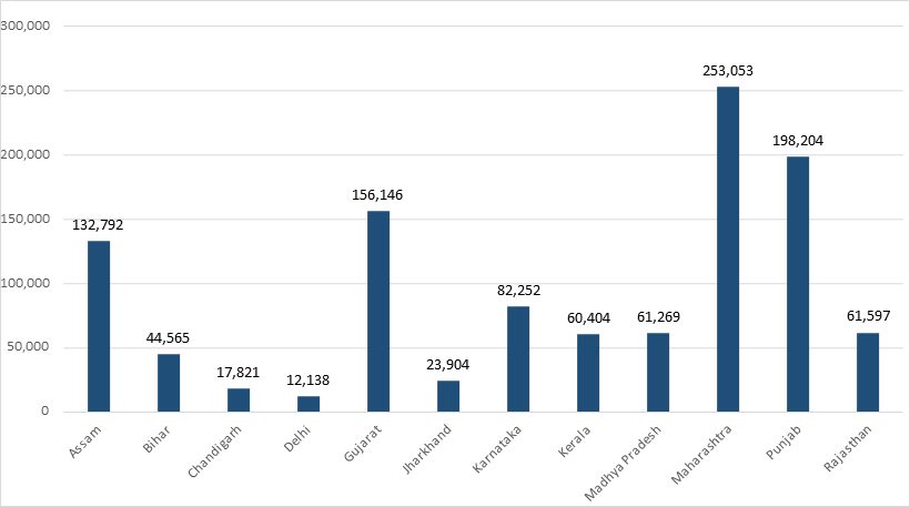
"I created a state-level sales summary to compare Total Amount across the different states represented in the dataset."
Built via an Excel PivotTable placed directly on the Dashboard sheet (cells A3:B20), this analysis aggregates sales transactions geographically. It aggregates revenue across 16 states and union territories, summing to a total of ₹1,501,664:
| State | Sum of Total Amount (INR) |
|---|---|
| Assam | ₹132,792 |
| Bihar | ₹44,565 |
| Chandigarh | ₹17,821 |
| Delhi | ₹12,138 |
| Gujarat | ₹156,146 |
| Jharkhand | ₹23,904 |
| Karnataka | ₹82,252 |
| Kerala | ₹60,404 |
| Madhya Pradesh | ₹61,269 |
| Maharashtra | ₹253,053 |
| Punjab | ₹198,204 |
| Rajasthan | ₹61,597 |
| Tamil Nadu | ₹128,087 |
| Telangana | ₹34,369 |
| Uttar Pradesh | ₹225,014 |
| West Bengal | ₹10,049 |
| Total Result | ₹1,501,664 |
This breakdown provides a clear geographic view of sales distribution, highlighting key regional revenue drivers such as Maharashtra, Uttar Pradesh, and Punjab.
SALES BY
CATEGORY
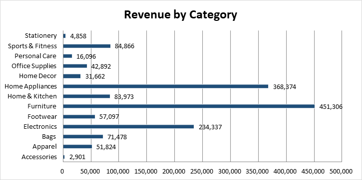
"I used SUMIFS to calculate total sales for each product category and used these calculations as the basis for the category visualization."
SUMIFS adds Total Amount only for records belonging to the selected category. The formula pattern dynamically evaluates category labels:
=SUMIFS('Clean Data'!$O$2:$O$201, 'Clean Data'!$G$2:$G$201, A32)
| Category | Total Sales (INR) |
|---|---|
| Accessories | ₹2,901 |
| Apparel | ₹51,824 |
| Bags | ₹71,478 |
| Electronics | ₹234,337 |
| Footwear | ₹57,097 |
| Furniture | ₹451,306 |
| Home & Kitchen | ₹83,973 |
| Home Appliances | ₹368,374 |
| Home Decor | ₹31,662 |
| Office Supplies | ₹42,892 |
| Personal Care | ₹16,096 |
| Sports & Fitness | ₹84,866 |
| Stationery | ₹4,858 |
| Total Sales | ₹1,501,664 |
ORDERS BY
PAYMENT MODE
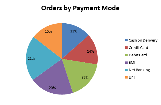
"I used COUNTIF to calculate how many orders were associated with each payment method."
The formula counts the number of records matching each payment method across column P of the Clean Data sheet:
=COUNTIF('Clean Data'!$P$2:$P$201, A49)
| Payment Mode | Order Count |
|---|---|
| Cash on Delivery | 27 |
| Credit Card | 28 |
| Debit Card | 35 |
| EMI | 40 |
| Net Banking | 41 |
| UPI | 29 |
| Total Orders | 200 |
03 — DASHBOARD
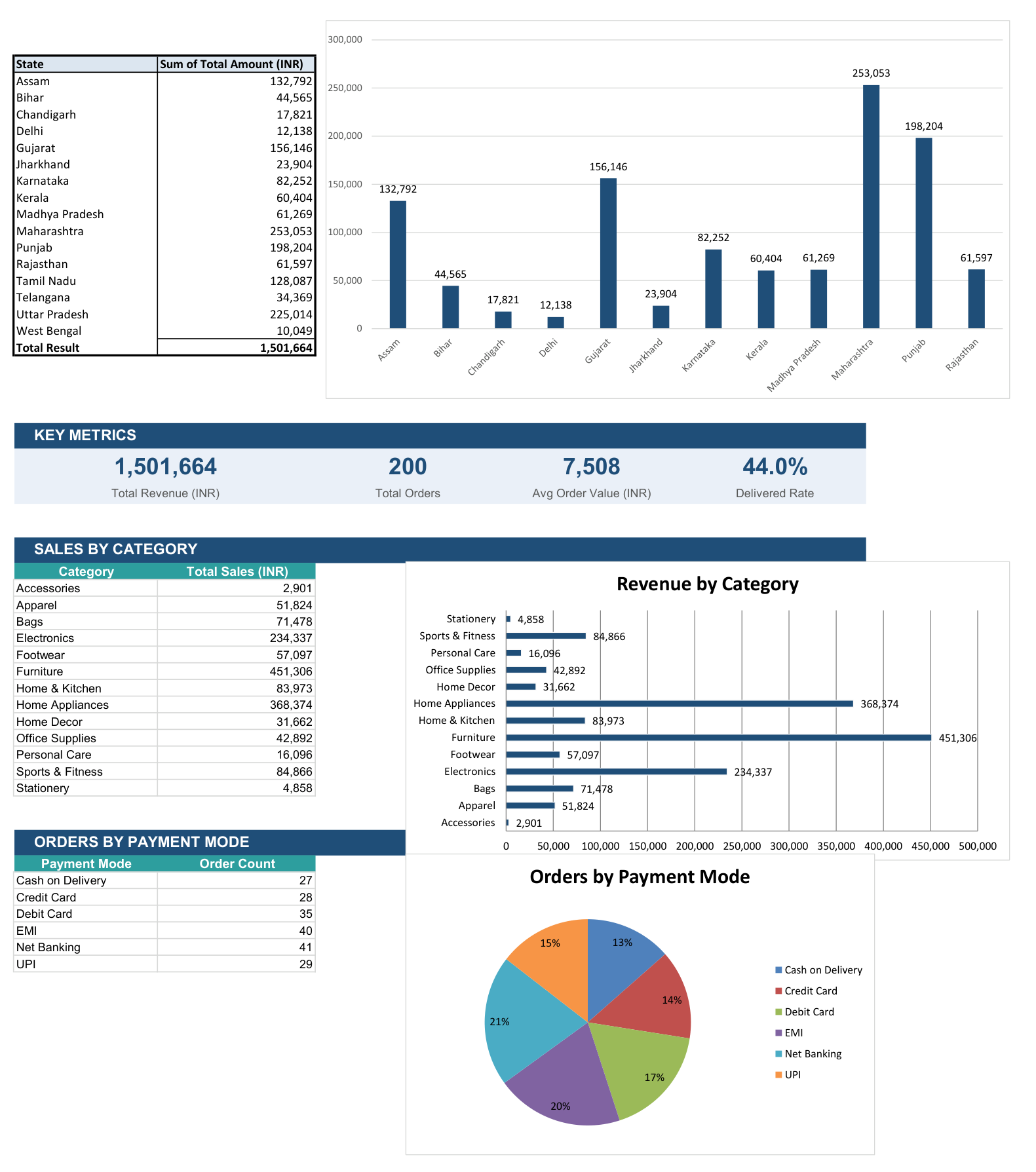
"The Dashboard brings the calculated metrics and analysis together into a single view."
The sheet brings together the complete analytical workflow in one cohesive interface:
- • Key Performance Indicators: 4 high-level summary cards (Revenue, Orders, AOV, Delivered Rate).
- • State-wise sales analysis: PivotTable summary comparing regional revenues.
- • Revenue by category: Formula-driven breakdown of product categories.
- • Orders by payment mode: Transaction frequency count across payment methods.
- • Three charts: Embedded Excel charts converting each summary table into visual form.
CHARTS &
VISUALIZATION
The dashboard features three embedded Microsoft Excel charts designed to communicate the underlying distributions clearly:
EXCEL SKILLS
USED
The techniques and features actively utilized and evidenced in this workbook include:
PROJECT
WORKFLOW
A structured progression from raw transactional records to synthesized visual reporting:
WHAT THIS PROJECT
DEMONSTRATES
PROJECT
OUTCOME
"The final workbook transforms a raw sales transaction dataset into a structured Excel analysis workflow. It combines data preparation, formula-based calculations, state-level analysis, category analysis, payment-mode analysis and dashboard visualizations to make the underlying sales data easier to understand."